
Perfect Properties: UI (from a UXer) for A Real Estate App
Interpreting Research and Implementing a Prototype
TL;DR Here's the prototype.
Overview and Context: Perfect Properties is a personal project that aims to make buying real estate easy and stress free. My goal was to design a clean and quick experience for on-the-go professionals who are looking to invest in a better future.
The main features of the app are the following:
Search and filter available properties
Compare properties
Contact real estate agents
Bookmark properties
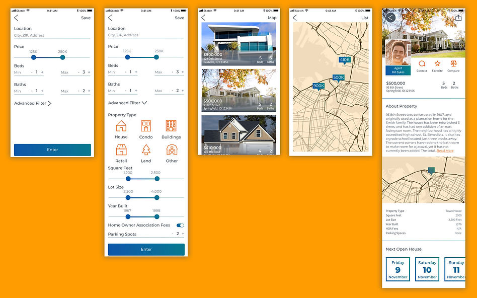
Low/Mid Fidelity Wireframes
After looking at the user personas, user flows, and with main features in mind, I began creating some low/mid fidelity mobile wireframes that addressed the main features needed in the app. I wanted to establish some of the basic task flows to show how users could immediately reach their goals.


Moodboards
I created two moodboards to ideate the visual direction for the app. I opted to choose the moodboard on the left (the yellow and green theme) it felt fresh and exciting with the bright colors, gradients, and bold graphics.
 |  |
|---|
Once I was able to determine the "mood", it was time to start to establish the style I wanted to take with the app.
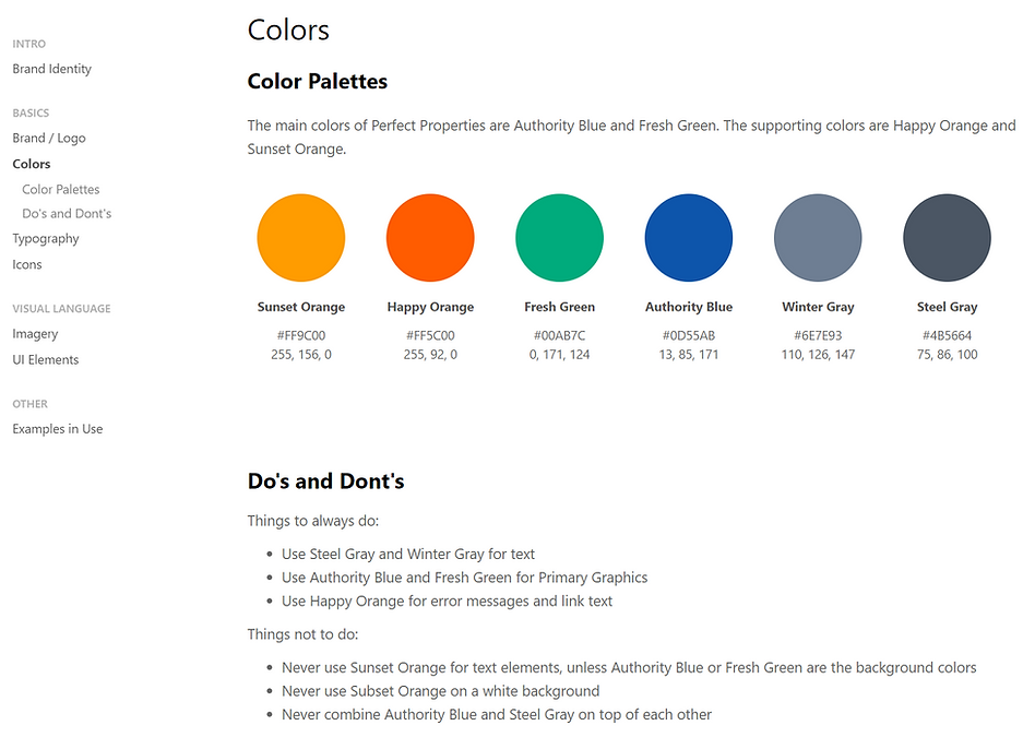
Style Guide
I created a Perfect Properties style guide with Frontify. This helped me standardize all of my elements and allows me to build for the future.
Mobile First Approach
My focus was on a mobile first approach. Since our users are on-the-go professionals, it was essential to build content from the smallest size to the largest.
Gestures
While building for mobile I focused on gestures. Mobile gestures allowed me to work flexibly and simplify otherwise complex features.
 |  |
|---|
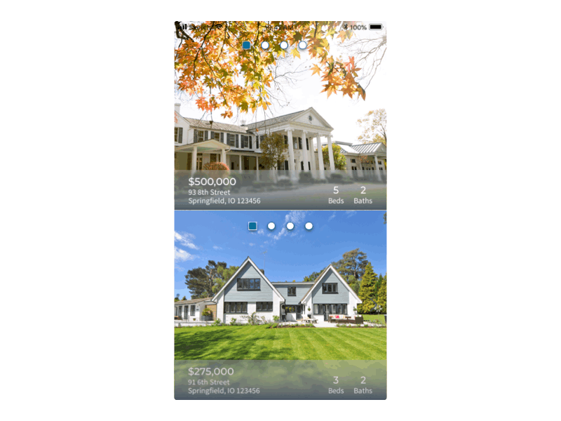
Final Mockups
For a final look at the app mock up, take a look at the Prefect Properties Prototype and the screens below.


Key Takeaways
I learned a lot in the two months it took to complete perfect properties. Some of the things I learned were:
The most challenging part was animating the screens in Principle, I found the program buggy with a hand to understand UI.
When working on a UI by yourself it is imperative to get opinions from mentors and peers. You can easily miss some layout issues when you've been looking at a design for too long.
A more in depth style guide will help you build better features through out the products life cycle.